8 Best Optometry Website Designs and Why They Work
In today’s competitive world of optometry, your practice’s website needs to have the right mix of SEO and a positive user experience to attract the most new patients.
Some practices stand out by setting a benchmark for excellence, and their practices are all the better for it. By prioritizing user experience, creating high-quality content, and effectively using SEO, these leaders show how to connect with and serve their patients well.
Your online presence is more than just clicks and traffic; it’s about turning virtual visitors into real-life patients. A strong SEO strategy isn’t optional; it’s the guide that leads potential patients to your practice.
Let’s explore 8 high-performing optometry website designs and discover the secrets behind their SEO success.
After the list, we explain the best practices of optometry websites that you can implement today!

Principles of Effective SEO Website Development
Behind every successful optometry website lies a well-planned blend of content, strategy, and design. It’s about more than just keywords and links; it’s about creating a digital ecosystem that not only attracts but also nurtures and converts. By prioritizing user experience, crafting high-quality content, and leveraging the power of SEO, these practices have set a benchmark for excellence in the field of optometry.
Why SEO is Essential for Every Small Optometry Practice
For small optometry practices, SEO is not just beneficial; it’s vital. Unlike larger practices that might have extensive marketing budgets, smaller practices need to make the most of every marketing dollar. SEO levels the playing field, allowing small practices to compete with larger entities. Here’s why a design-focused approach is crucial:
- Increased Visibility: With effective SEO, your practice appears in front of potential patients precisely when they’re searching for eye care services. This increased visibility can lead to higher website traffic and more appointments.
- Credibility and Trust: High search rankings signal to potential patients that your practice is credible and trustworthy. When your website appears at the top of search results, it’s perceived as more authoritative.
- Cost-Effective Marketing: Compared to traditional advertising, SEO is a cost-effective way to attract new patients. Organic search traffic is free, and the return on investment can be substantial when done correctly.
- Local Reach: For any brick and mortar business, attracting local patients is essential. Local SEO strategies ensure that your practice is visible to people searching for eye care services in your area.
- Patient Engagement: A well-optimized website not only attracts visitors but also engages them with valuable content, encouraging them to choose your practice over others.
Essential Elements of Great Optometrist Website Design
Creating a standout website for eye care professionals requires more than just good looks. It’s about understanding the needs of both the professionals and their patients. Here are the key components:
Clear, Compassionate Communication: Your website is often the first interaction with potential patients. Effective communication about services, eye health tips, and appointment scheduling is crucial, emphasizing clarity and empathy.
- Intuitive Navigation and User Experience: A seamless user experience impacts how prospective patients view your practice. Easy-to-navigate menus, quick load times, and mobile responsiveness reduce roadblocks on the path to converting.
- Educational Content: Providing informative articles and guides on various eye care topics helps your website rank higher in search engines and establishes your practice as a trusted authority.
- SEO Strategies: Using keywords like “eye care,” “optometry,” “best optometry websites,” and “eye doctor” strategically enhances search engine visibility. Including your city name helps, too.
- Modern Features for Patient Engagement: Features like online appointment management and automated messaging improve patient convenience and engagement.
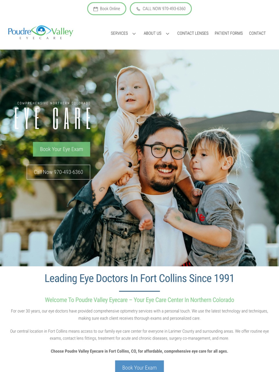
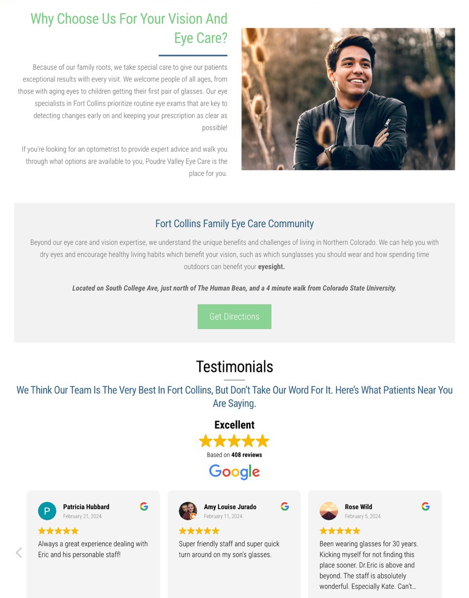
- Rich Content: Their website design isn’t just informative; it’s a treasure trove of industry-relevant keywords, ensuring they’re always on Google’s radar.
- Local SEO: With strategic local SEO techniques, they’ve woven themselves into the fabric of the Colorado community, establishing trust and connection.
- Thought Leadership: Through a regularly updated blog, they offer eye-day questions and answers about eye care, positioning themselves as the go-to experts in eye care.
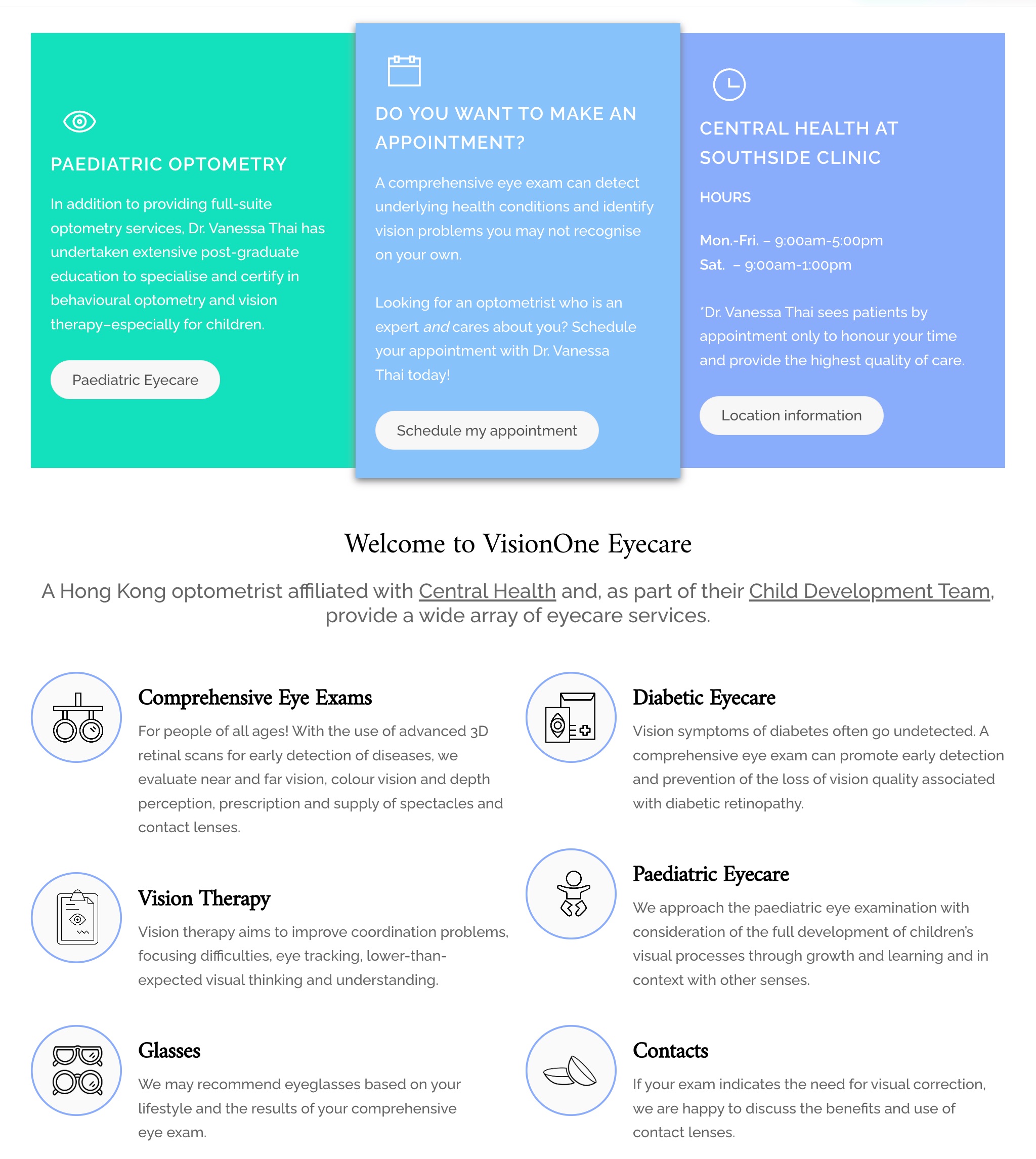
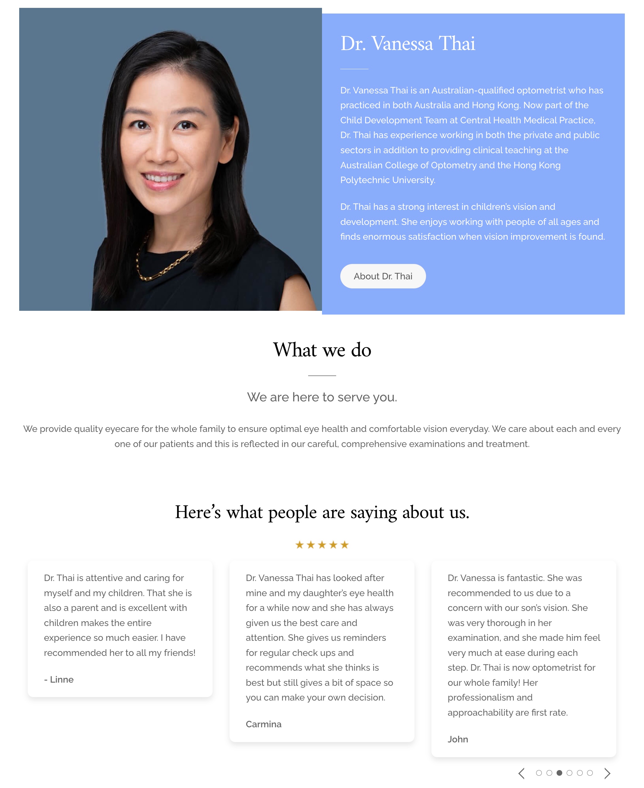
- Intuitive Navigation: Navigating their website feels like a breeze, thanks to a seamless, user-friendly design that keeps visitors engaged and informed.
- Strong External Linking: By strategically linking to eye health resources, they don’t just educate; they elevate their credibility, becoming a trusted source of information.
- Trust Building: Through a compelling “About our Doctor” section, the design fosters trust, turning visitors into loyal patients.
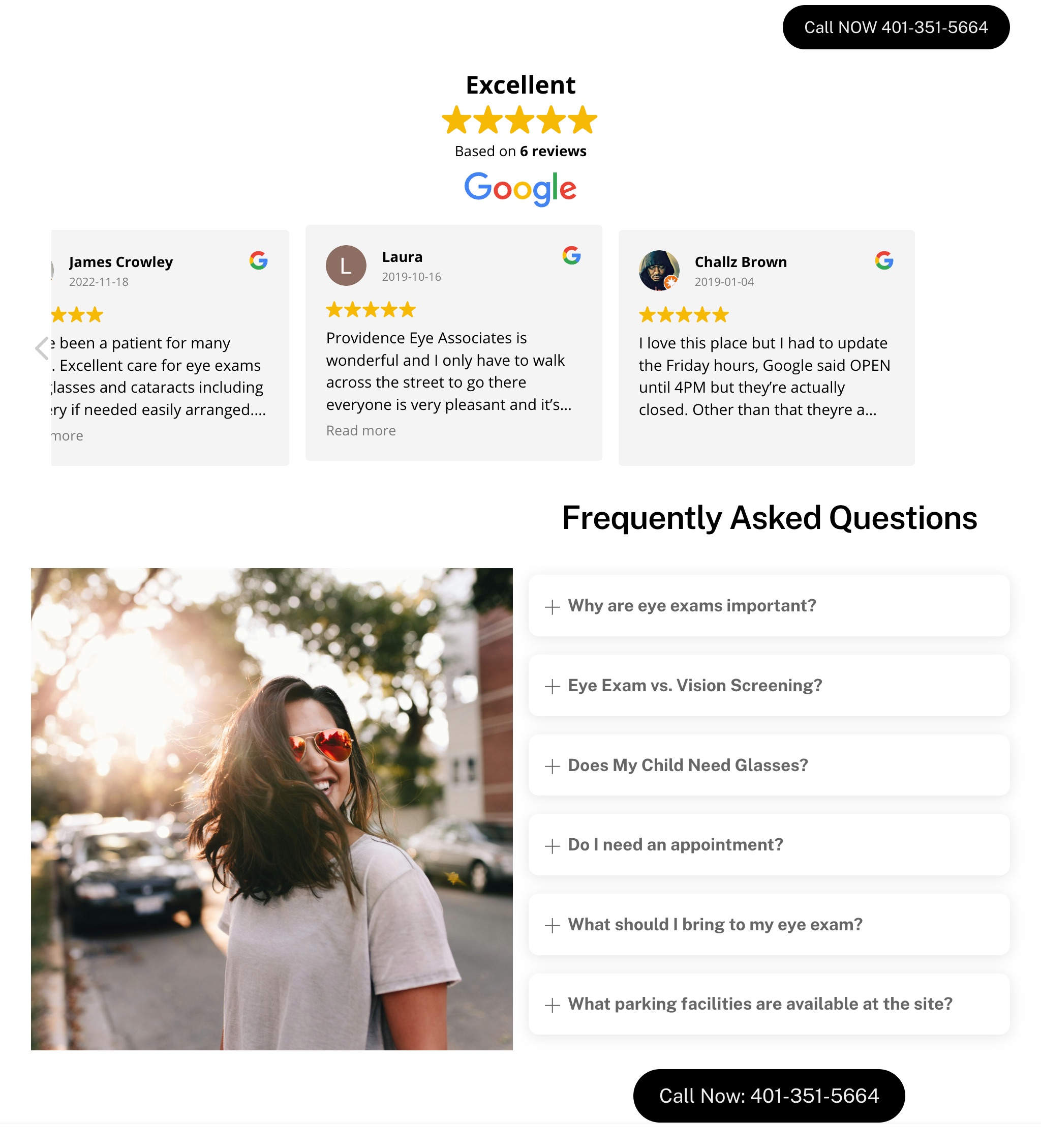
- Local Engagement: Leveraging Google My Business reviews, they showcase not just their expertise but also the unwavering trust of their community.
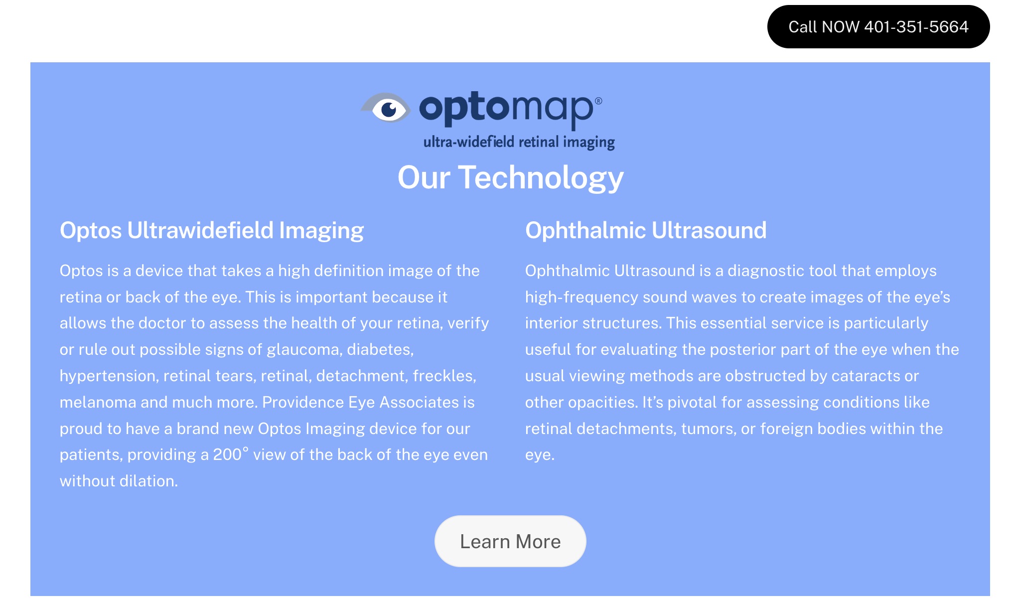
- Technology Showcase: Highlighting their unique equipment, they don’t just stand out; they soar above the competition, offering unparalleled service.
- Preemptive FAQ: Anticipating patient concerns, they don’t just answer questions; they alleviate fears, fostering a sense of confidence and comfort.
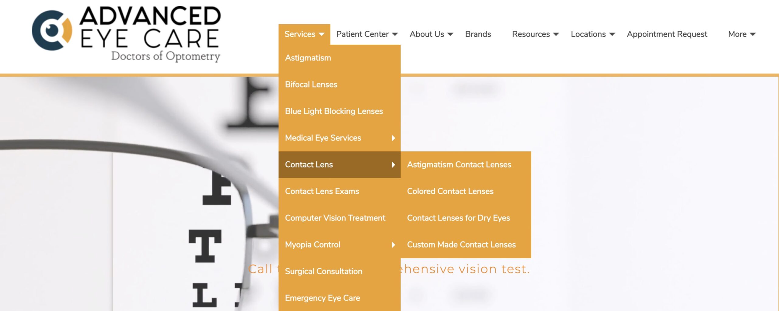
- Keyword Optimization: From astigmatism to colored lenses, they’ve optimized every page to ensure they’re always at the top of search results.
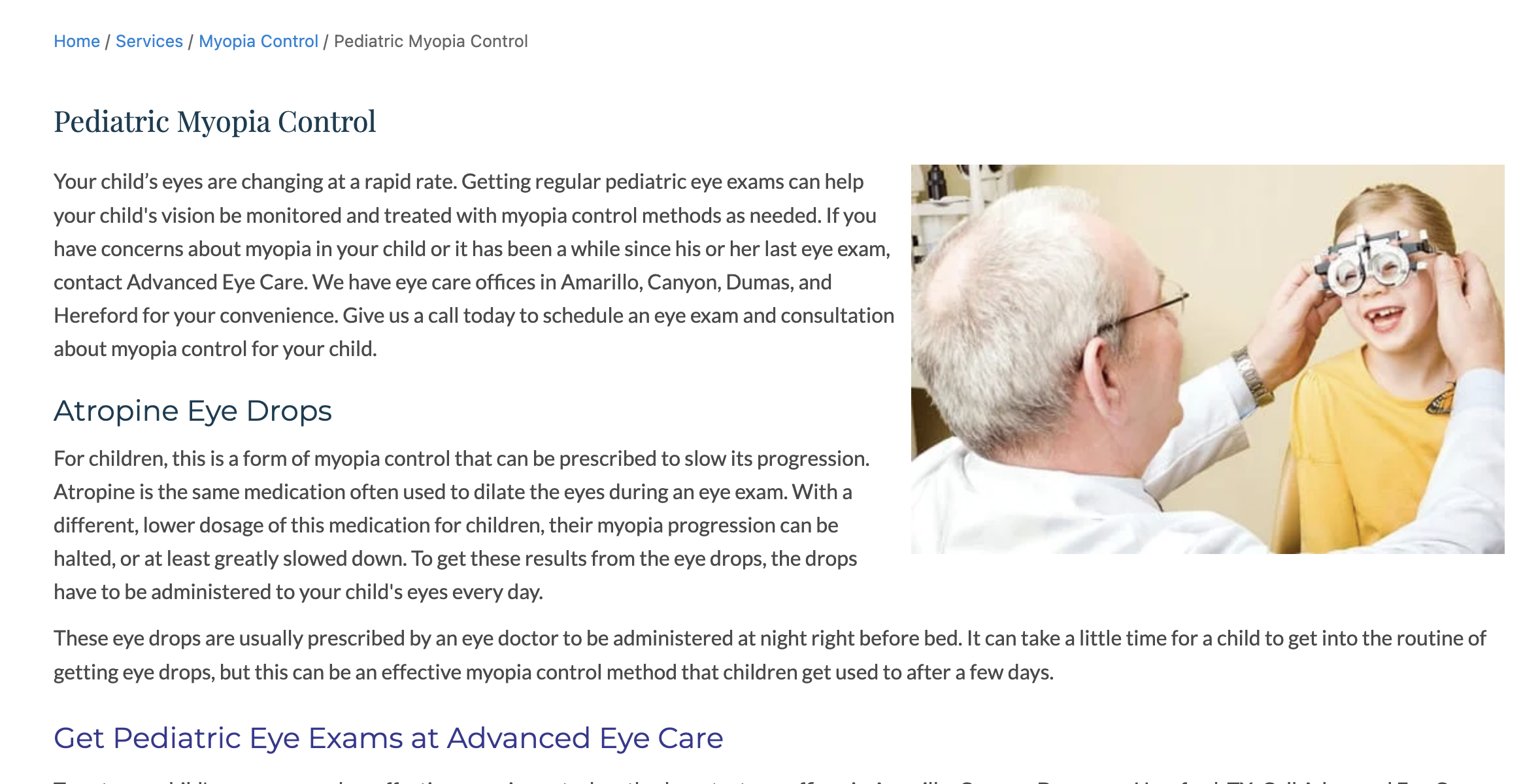
- Navigation Clarity: With breadcrumbs guiding the way, visitors never feel lost, ensuring a seamless browsing experience from start to finish.
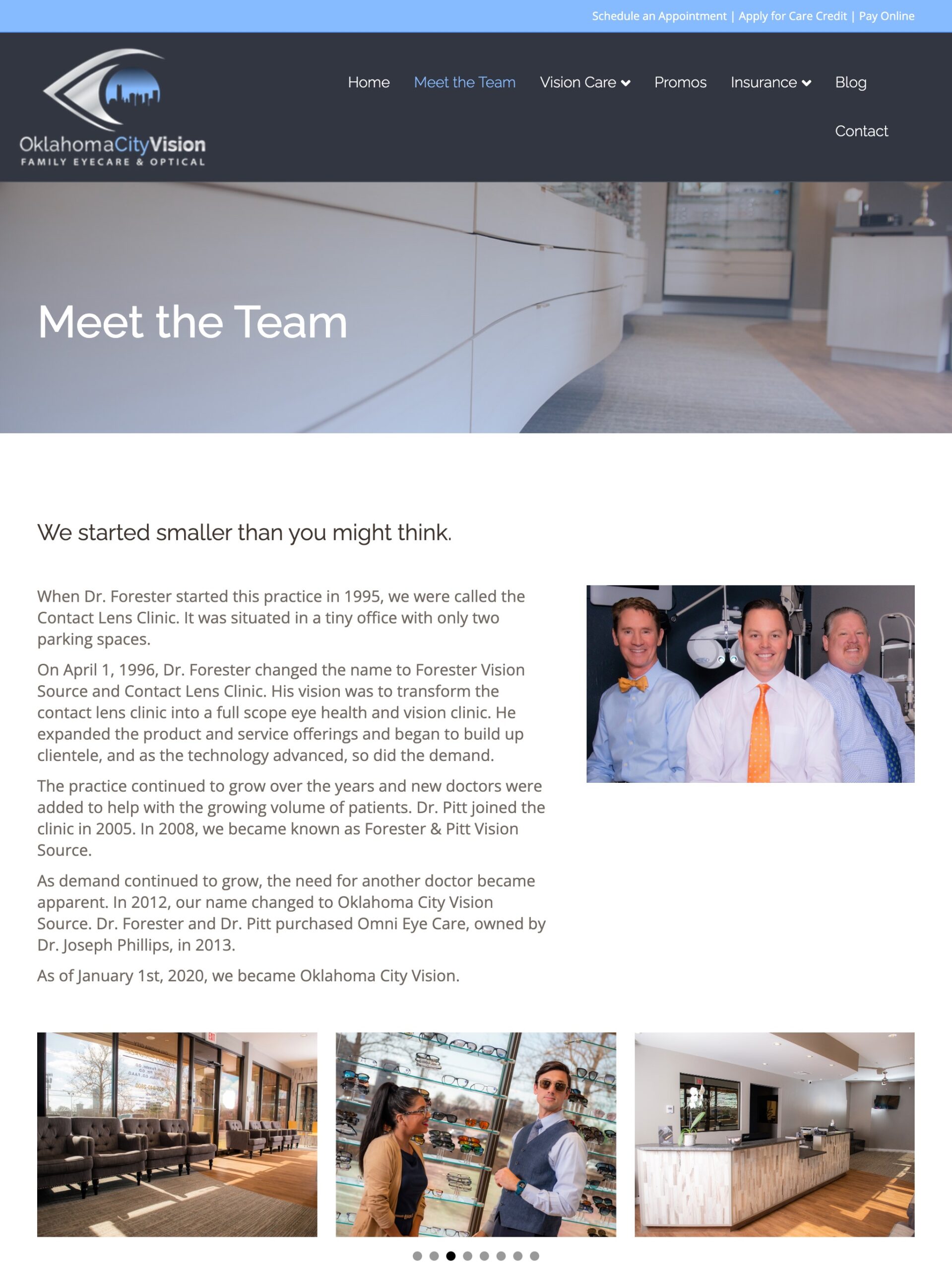
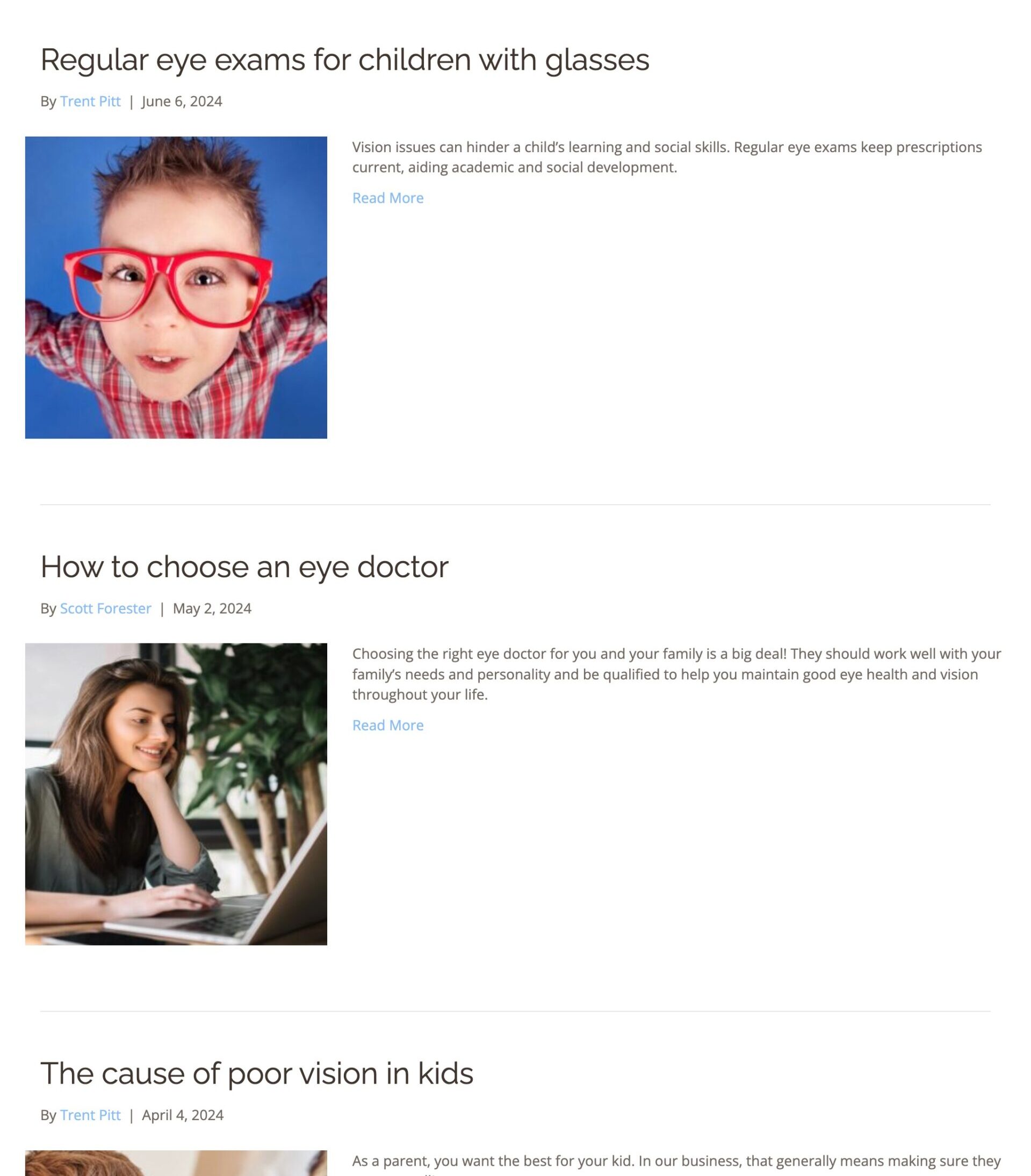
- Informative Blogging: Through comprehensive blog posts, they don’t just educate; they empower, answering questions and addressing concerns while reinforcing their expertise.


- Clear Call-to-Action: With a homepage optimized for booking exams, they don’t just attract visitors; they convert them into patients, one click at a time.


- Clear Call-to-Action: With a homepage optimized for booking exams, they don’t just attract visitors; they convert them into patients, one click at a time.


- User Convenience: With vital information front and center, visitors never have to search for what they need, ensuring a seamless and satisfying browsing experience.
- Appealing Design: From the moment visitors land on their homepage, they’re captivated by an aesthetic that blends professionalism with warmth.


- User-Friendly Contact Page: The contact page is well-designed, featuring complete and easily accessible NAP (Name, Address, Phone) information.
- SEO-Optimized Footer: The footer includes clearly labeled hours of operation, main page links, and a concise, descriptive “About Us” section for improved SEO.

- Engaging and informative Contacts page: Features a helpful video and a step-by-step guide for contact lens application and removal.
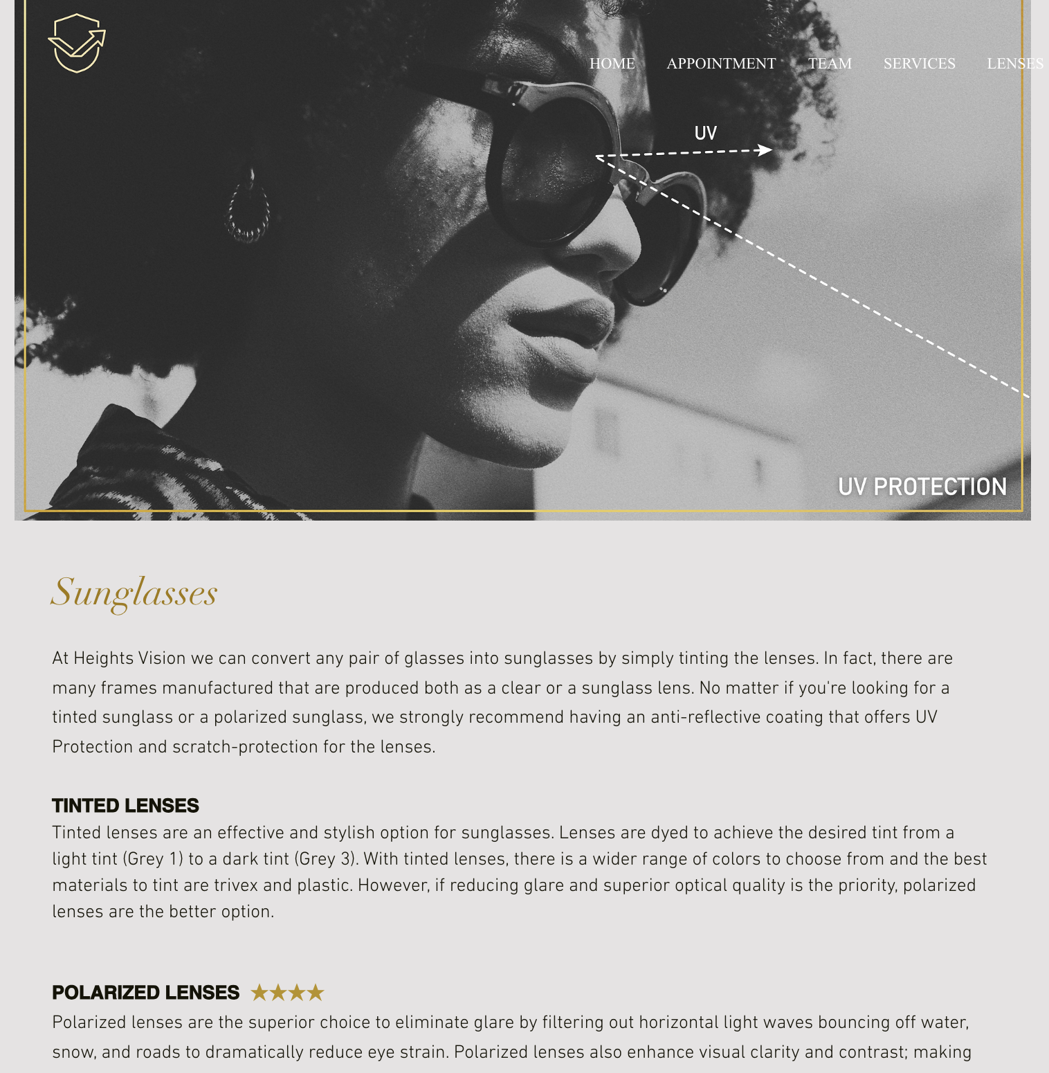
- Comprehensive Lens Information: Provides details on lens materials, digital lenses, anti-reflective coatings, progressive lenses, occupational progressives, photochromic lenses, sunglasses, and more.
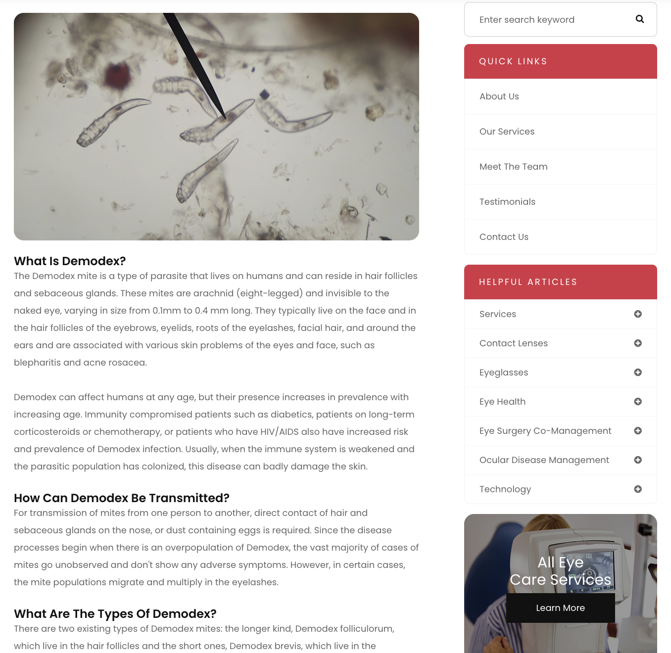
- Enhanced Sidebar: A thoughtfully structured sidebar improves user experience by bolstering internal linking. This setup not only makes it easier for visitors to navigate the site but also promotes relevant content, encouraging deeper engagement with related topics.
- Organized, Comprehensive Blog: The blog is a rich resource, packed with high-quality, informational posts that cater to various interests. Each post is carefully categorized, allowing readers to easily find content that meets their needs, whether they’re browsing by topic or exploring related articles.
Conclusion
By embracing SEO-focused design principles, these practices have created lead-generating websites that keep them ahead of the competition. As the digital landscape continues to evolve, one thing remains clear: the future of optometry belongs to those who dare to dream big and optimize even bigger. Even for small practice owners, staying competitive in SEO is possible.

